I watched the F1 movie and built a data dashboard. Here's what I learned.
How a Lando Norris Wikipedia spiral turned into a three-page Streamlit dashboard — the bugs, the wrong assumptions, and what FastF1 actually gives you.
I’ll be honest about how this started: I watched the F1 movie, thought it was great, and then spent the next three hours reading about Lando Norris winning the 2025 championship. By midnight I had FastF1 installed and was reading documentation.
I’m a data analyst. When something captures my attention, I analyze it.
This is a write-up of what I built — three pages of a Streamlit dashboard for Formula 1 data — and what I learned in the process. The project isn’t finished. Page 4 (telemetry) is still ahead. But the things that went wrong along the way are worth documenting now, while they’re fresh.
What the dashboard does (so far)
Three pages, three different data problems:
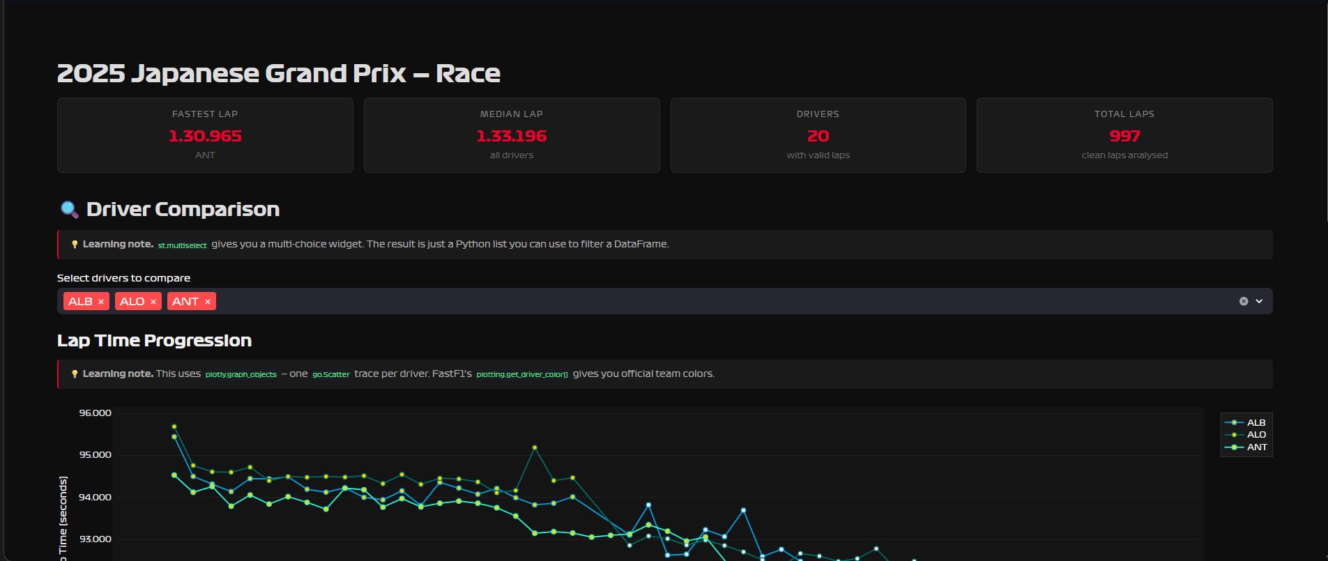
Page 1 — Lap Time Explorer. Pick a season, a Grand Prix, a session type. See every driver’s lap time progression across the race, colored by tyre compound. See how pace degrades as rubber wears. See the fastest lap per driver in a ranked table.
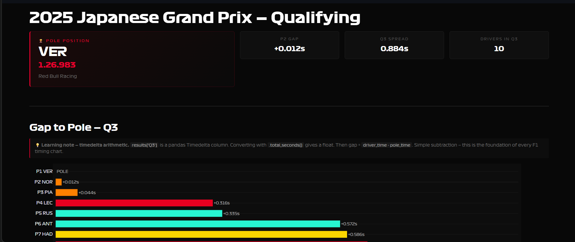
Page 2 — Qualifying Deep Dive. The official Q1/Q2/Q3 best times per driver, a gap-to-pole bar chart, a full Q1→Q2→Q3 elimination table, and a radar chart comparing two drivers across all three qualifying rounds.
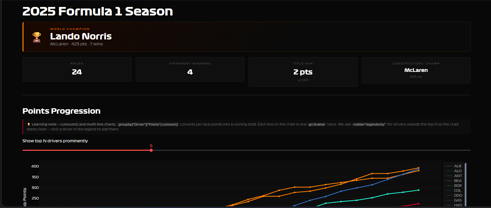
Page 3 — Season Dashboard. Full championship standings, points progression across every race of the season, constructor battle, race winners by round. Works for any season from 2003 to 2025.
The data sources
Two sources, very different in how you interact with them.
FastF1 is a Python library that wraps Formula 1’s live timing data. You install it, import it, and get DataFrames back — it feels like working with pandas, which means it feels familiar. Session data, lap-by-lap telemetry, sector times, tyre compounds, everything from 2018 onward. The catch: loading a session for the first time takes 20–30 seconds while it fetches and caches. After that, instant.
session = fastf1.get_session(2025, "Bahrain", "R")
session.load(laps=True, telemetry=False)
laps = session.laps  # pandas DataFrame
Jolpica API is a REST API — the open-source successor to the Ergast database, which shut down in 2024. No Python wrapper, no API key. You call it with requests, get JSON back, parse it into DataFrames yourself. It covers season-level data: standings, race results, constructor points, all the way back to 1950.
url = f"https://api.jolpi.ca/ergast/f1/{year}/driverStandings.json"
r = requests.get(url, timeout=10)
data = r.json()
# parse MRData → StandingsTable → StandingsLists → DriverStandings
The choice between them depends on the question. Lap-level analysis → FastF1. Season-level statistics → Jolpica. For Page 3 I started trying to use FastF1’s Ergast wrapper and hit a 403 Forbidden immediately — the wrapper was pointing at a deprecated endpoint. Switching to raw requests calls against Jolpica took ten minutes and worked first try. Sometimes the library is the problem.
What I didn’t know about F1 (and had to learn to build this)
I genuinely didn’t know how qualifying worked before this project. For anyone else who just watched the movie:
Qualifying is three knockout rounds on Saturday. All 20 drivers go out in Q1 — the 5 slowest are eliminated and start the race from the back. 15 drivers continue to Q2, same format, 5 more eliminated. The final 10 fight for pole position in Q3. The fastest Q3 lap is pole — P1 on the starting grid.
This matters for the code because session.laps doesn’t tell you which round a lap belongs to. There’s no Session column with values like “Q1”, “Q2”, “Q3”. I assumed there would be, built the whole page around that assumption, and hit a KeyError when I ran it.
The actual solution: session.results already has the official Q1, Q2, Q3 best times as separate columns — one row per driver, NaT where a driver didn’t participate in that round. FastF1 did the work already. I just looked in the wrong place.
results = session.results.copy()
# columns include: Q1, Q2, Q3 — each a pandas Timedelta
results["Q3_s"] = results["Q3"].apply(lambda td: td.total_seconds())
gap_to_pole = results["Q3_s"] - results["Q3_s"].min()
The lesson isn’t “know the API better.” The lesson is: when your assumption fails, check what the library actually gives you before rebuilding around the assumption.
Three bugs worth writing down
The Streamlit button that did nothing.
Streamlit reruns the entire script from top to bottom on every interaction — every click, every dropdown change. I had this structure:
if "session" not in st.session_state:
    st.stop()  # ← kills execution here

if load_btn:            # ← never reached on first click
    session = load_session(...)
    st.session_state["session"] = session
The button handler was below the st.stop(). On the first click, there’s no session yet, so st.stop() fires and the load never happens. Fix: button handler first, early exit second. Always.
if load_btn:            # ← handle the click first
    st.session_state["session"] = load_session(...)

if "session" not in st.session_state:
    st.stop()           # ← now this only blocks the display, not the load
Plotly and 8-digit hex colors.
FastF1 returns team colors as standard 6-digit hex strings like #E8002D. I tried to add transparency by appending two digits: #E8002D33. That’s valid CSS, but Plotly doesn’t accept it.
ValueError: Invalid value of type 'builtins.str' received for the 'fillcolor' property
Received value: '#0600ef33'
Plotly wants rgba(r, g, b, alpha). Wrote a small helper, use it everywhere now:
def hex_to_rgba(hex_color: str, alpha: float = 0.2) -> str:
    h = hex_color.lstrip("#")
    r, g, b = int(h[0:2], 16), int(h[2:4], 16), int(h[4:6], 16)
    return f"rgba({r},{g},{b},{alpha})"
Pagination on the Jolpica API.
For season race results — all rounds, all drivers — the API returns max 100 rows per call. An F1 season has ~24 races × 20 drivers = ~480 rows. If you don’t paginate, you silently get only the first 100 rows and your standings are wrong.
while True:
    url = f"{BASE}/{year}/results.json?limit={limit}&offset={offset}"
    data = requests.get(url).json()
    total = int(data["MRData"]["total"])
    # ... parse races ...
    offset += limit
    if offset >= total:
        break
The API tells you the total in every response. Check it, loop until you have everything. This is a standard pattern for any paginated API.
The custom F1 font
The official Formula 1 typeface exists. I had the .ttf files. Getting them into Streamlit was not obvious.
Streamlit doesn’t serve static files the way a normal web server does, so you can’t reference a font file by path in CSS. The solution: encode the font files as base64 strings and embed them directly in a @font-face CSS block as data URLs. The font travels inside the HTML itself.
I put this in a f1_font.py module with a single inject_font() function. Every page calls it once. Two lines per page, consistent typography across the whole dashboard.
# f1_font.py
import base64, streamlit as st

_REGULAR_B64 = "..."  # base64-encoded .ttf

_CSS = f"""<style>
@font-face {{
    font-family: 'Formula1';
    src: url(data:font/truetype;base64,{_REGULAR_B64}) format('truetype');
    font-weight: 400;
}}
* {{ font-family: 'Formula1', sans-serif !important; }}
</style>"""

def inject_font():
    st.markdown(_CSS, unsafe_allow_html=True)
What’s next
Page 4 — Telemetry. Speed traces overlaid for two drivers on the same lap. Throttle and brake heatmaps. A track map colored by speed. This requires session.load(telemetry=True) and working with GPS coordinates — a different level of complexity than anything in Pages 1–3.
Deployment. Streamlit Community Cloud is free and deploys directly from a GitHub repo. Once Page 4 is done, the dashboard goes public. A live link beats a screenshot every time.
Possibly: a BigQuery backend. Right now every user who loads a session triggers a fresh FastF1 fetch. A smarter architecture would pre-load race sessions into BigQuery on a schedule and serve the dashboard from there — the same pattern I use at work. That would make the dashboard feel instant.
The F1 movie was good. The data is better.
GitHub repo and live link coming when Page 4 is done.